
Global chrome and navigation
The global chrome is the persistent frame — top header, left navigation rail, and footer — that surrounds every authenticated screen in UserSearch. It stays fixed while the main content area changes, so the controls described here behave the same on the Dashboard, the Bookmarks page, and the Account pages alike.
This page also covers the three Dashboard view modes and the header context controls (Case, Forensic Mode, Status, Mobile) that persist across all of them.
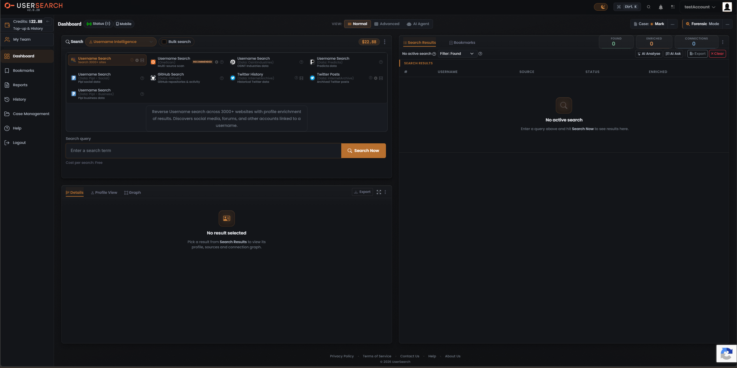
Top header
Section titled “Top header”The header is identical across every authenticated screen.
Branding (far left)
Section titled “Branding (far left)”- A circular coral ring-with-dash mark sits at the far top-left.
- The wordmark reads USERSEARCH, with “USER” in white and “SEARCH” in coral-orange.
- A version string sits directly beneath the wordmark, reading v2.0.20.
Right-side control cluster
Section titled “Right-side control cluster”The header’s right-side controls appear in a fixed order and are present on every screen. From left to right:
| Control | Appearance | What it does |
|---|---|---|
| Theme toggle | Pill with a moon-and-stars icon on a filled track | Switches between dark and light themes. The app ships in dark theme. |
| Command palette | Bordered pill: command glyph + Ctrl K | Press Ctrl+K (or click the pill) to open a quick-command overlay. |
| Header magnifier | Search icon, immediately right of the Ctrl K pill | Opens a global search affordance. |
| Notifications | Bell icon | Opens a notifications panel. |
| Apps grid | 2×2 dot-grid icon | Opens an app/module launcher menu. |
| Account menu | Account label + downward chevron | Opens an account dropdown (profile, settings, logout). |
| Avatar | Square user thumbnail at the far top-right | Opens the account/profile area. |
Left navigation
Section titled “Left navigation”The left navigation rail carries the same item set on every screen. Exactly one item is highlighted as active at a time, reflecting the screen you are on.
Credits block (top of the rail)
Section titled “Credits block (top of the rail)”- A wallet icon labelled Credits: followed by a balance value.
- Credits are denominated in dollars in this build.
- Beneath the balance is a Top-up & History link, which opens the Account Credits & Team Licenses screen.
Navigation items
Section titled “Navigation items”The item order is fixed, top to bottom:
- Credits / Top-up & History — see the Credits block above.
- My Team — opens the Account Credits & Team Licenses page.
- Dashboard — opens the search Dashboard.
- Bookmarks — opens the Bookmarks page.
- Reports — opens a Reports screen.
- History — opens a search-History screen.
- Case Management — opens the Case Management screen.
- Help — opens a Help/support resource.
- Logout — ends the authenticated session.
A collapse control (a left-pointing arrow at the right edge of the Credits block) is expected to collapse the rail; the collapsed state has not yet been captured.
Footer
Section titled “Footer”The footer appears identically on every screen, centered at the bottom:
- Link row: Privacy Policy · Terms of Service · Contact Us · Help · About Us
- Copyright line: © 2026 UserSearch
Dashboard header row
Section titled “Dashboard header row”The Dashboard’s main content area opens with a header row containing the page title, a set of context controls, and a central view-mode segmented control.
Title and left-side pills
Section titled “Title and left-side pills”- The page is titled Dashboard.
- A Status pill with a live-signal icon and a parenthesised count sits next to the title (for example, Status (8)).
- A Mobile pill (phone icon) sits to the right of the Status pill. It switches the Dashboard into a mobile-optimised layout.
View-mode toggle
Section titled “View-mode toggle”Centered in the header is a segmented control labelled VIEW: with three mutually exclusive segments:
- Normal — the base two-column workspace.
- Advanced — the Normal workspace plus inline case panels.
- AI Agent — a promo gateway to the AI Agent workspace.
Selecting a segment re-renders the Dashboard body in place. It does not trigger a full page navigation: the header, left nav, Credits block, footer, and the Case, Forensic Mode, Status, and Mobile controls all persist. View mode is a presentation switch, independent of Forensic Mode and of the selected Case.
Header context controls
Section titled “Header context controls”These controls sit at the header-right and remain visible in all three view modes:
- Case: shows the active Case with a status dot, plus an overflow (…) menu. See Case Management for full mechanics.
- Forensic Mode with an overflow (…) button at the far header-right. See the Forensic Mode section below.
- Status and Mobile pills (described above).
The three view modes
Section titled “The three view modes”Normal view
Section titled “Normal view”Normal lays out the Dashboard as a two-column workspace:
- Left — Search panel. A Search type selector, a Bulk search checkbox, a Credits/cost pill, and an overflow menu; below sits a grid of Module tiles, a description of the selected Module, an Enter a search term input, a coral Search Now button, and a per-search cost line.
- Right — Results panel. Search Results and Bookmarks tabs; three counter tiles — Found, Enriched, and Connections — a Filter: Found dropdown, and the actions AI Analyse, AI Ask, Export, and Clear. The results table columns are #, USERNAME, SOURCE, STATUS, and ENRICHED, with an empty state until you run a search.
- Lower panel. Result-detail tabs — Details, Profile View, Graph — an Export button, and an empty state until you select a result.
Advanced view
Section titled “Advanced view”Advanced retains the entire Normal layout and adds two inline case-management panels beneath the Search panel:
- Case panel — a Select a Case dropdown, an + Add New button, a bookmarks count, a last-update timestamp, and an overflow menu. The panel’s active Case is bound to the header Case: control.
- Case History panel — subtitle Keep Track on your case history and a two-column log table (EVENT · TIME), with each row carrying an absolute timestamp and a relative-time chip.
In Advanced view, the Details / Profile View / Graph section moves down to sit opposite the case panels; its empty state is unchanged.
AI Agent view
Section titled “AI Agent view”AI Agent view replaces the entire Dashboard body with a single centered promo card and hides the Search panel, Results panel, and case panels. The card shows an AI Investigation Agent heading, a short description, and a coral Open AI Agent → button that launches the AI Agent / S.A.R.G.E. search interface.
The left nav, top header, all header context controls (VIEW toggle, Case, Forensic Mode, Status, Mobile), and the footer all persist.
View-mode comparison
Section titled “View-mode comparison”| Aspect | Normal | Advanced | AI Agent |
|---|---|---|---|
| Search panel + Module grid | Yes | Yes | Hidden |
| Search Results panel | Yes | Yes | Hidden |
| Details / Profile View / Graph | Yes | Yes (repositioned) | Hidden |
| Case panel (inline) | No | Added | Hidden |
| Case History panel | No | Added | Hidden |
| Body content | Two-column workspace | Workspace + case panels | Single promo card |
| Chrome, footer, header context controls | Persist | Persist | Persist |
Active Case control
Section titled “Active Case control”The header Case: control shows the current active Case with a status dot and an overflow menu, present in all three view modes. In Advanced view, the inline Case panel is bound to this control, so selecting a Case in the panel updates the global active Case.
Forensic Mode control
Section titled “Forensic Mode control”A Forensic Mode control with an overflow (…) button sits at the far header-right and persists across all three view modes. A separate per-Case Forensic Mode switch exists in Case Management.
Verified against UserSearch v2.0.20